5 Examples of Inspired Checkout Processes That Bring Results
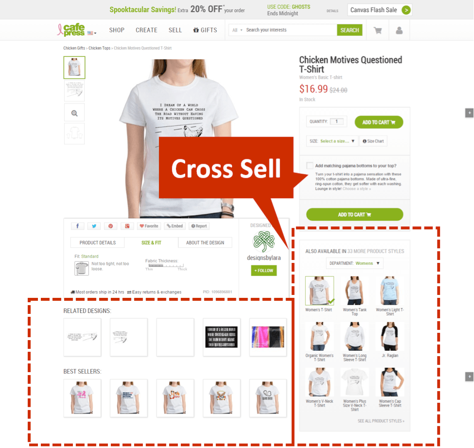
Table of contents:
One of the best things about online shopping is not having to wait in line behind a long line of equally frustrated shoppers at the cash register. You have your very own cashier every single time you decide to log on to your favorite ecommerce site and indulge in some retail therapy.
The problems begin when this so called ‘personal cashier’ behaves like a nitpicking ringmaster, making you jump through a million hoops till you can wave them goodbye.
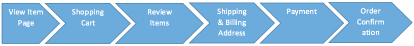
Now, a typical checkout process has six stages, which may be compressed or expanded based on the brand in question.
So, what does a great checkout process make? Minimal steps? Short forms to fill up? Zero distractions? Smart upsells and cross-sells? Let’s find out by examining what makes the checkout processes of some of the best in the business click.
1. Keep the Checkout Process Short, Keep the Forms Shorter
Go back to the serpentine queues at your local department store. You wouldn’t want to subject your user to something similar online, right?
Have mercy on your users and keep your checkout flow as tight and short as possible. They will thank you for your brevity and your cash registers will thank you for the design smarts.
According to research by the Baymard Institute, the average checkout flow has 5.08 steps. Shoot for a checkout flow that hits well below 5 steps to stand out from competition.
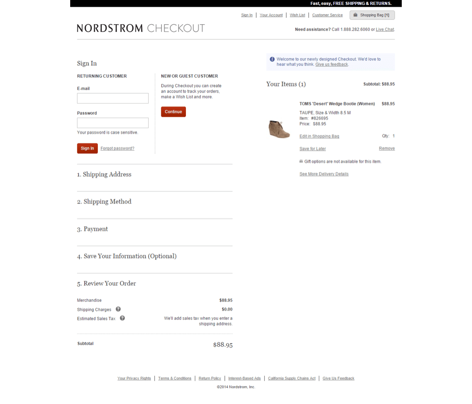
Brick and mortar retail giant Nordstrom hits the nail on the head with their brand new checkout design. Not only do they follow the first rule of great check out design – self-contained checkouts – they also have a beautiful accordion design that fits the entire checkout process into one single page. Open source ecommerce platforms like PrestaShop have these clean and aesthetic one-page checkouts as plug and play modules, making a switchover to such layouts super simple.
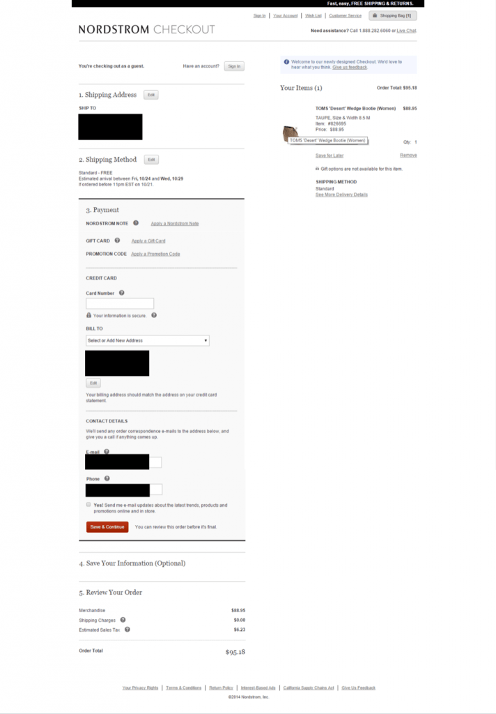
Only three sections in Nordstrom’s checkout flow need any actual data entry on part of the user. By copying over the shipping address to the payments page, redundant questions are avoided. The page seeks only as much personal information as is absolutely necessary, with explanations on how the information is going to be used.
2. Self-Contained Checkout Process
Once the user has picked their items and proceeded to create a shopping cart, it is time for your conversion chops to swing into overdrive. Remove any possible distraction from the user’s path – including the rest of your site – let them focus on the task of completing the purchase.
I stress on this as my number one change to any checkout process for a very simple reason. Over 68% of ALL shopping carts are abandoned mid-checkout, resulting in trillions of dollars’ worth of losses for the e-commerce industry as a whole. Fixing the cracks through which these shoppers slip by can mean the difference between being an industry beater and an also-ran.
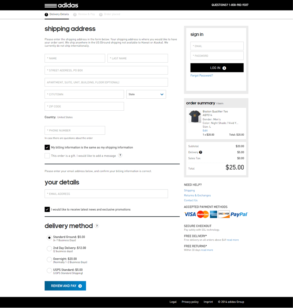
Adidas gets this concept perfectly and its checkout process is simple, short, and self-contained. There is no navigation bar to take the user away to some other section, no pop-ups requesting their opinions on some obscure topic, no ads (internal or third-party) that takes the user’s eye off the main prize – the purchase.
3. Death to Compulsory Registration
If there’s one thing that pushes a user quicker down the abandoned shopping cart highway, it’s a compulsory registration to proceed with the purchase. A survey by Econsultancy showed that over a quarter of users would drop off fro1m the shopping cart when forced to create a brand new account and register with the site.
Guest checkouts are an increasingly standard feature of most ecommerce sites today. But what sets the real winners apart is the finesse with which they let the customer pick between registration and proceeding as a guest.
Take Crate & Barrel for instance.
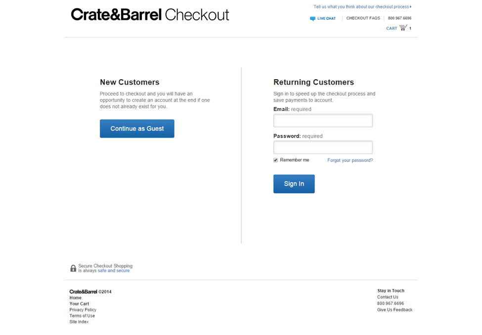
Not only do they have a clean and non-confusing layout for the sign in / guest checkout page, they also allow guest users to create an account AFTER the purchase is complete. This satisfies the data hungry digital marketer’s needs while still being unobtrusive in the shopping process.
4. Cross Sell and Upsell
Before the customer proceeds to pay for their item, it’s a great idea to offer them complementary items that go well with their original purchase. Not only is a cross-sell healthy for your bottom line, it is good for your customer experience as well, as the user gets to check out items they might otherwise have missed out on. Research confirms this, with 56% of online shoppers more likely to return to a site that offers product recommendations.
The trick lies in offering these items in such a way that the customer does not forget about the current shopping cart. A persistent shopping cart like the one offered by Old Navy is a good way to keep the user on track with their earlier selections even after they have wandered off to pick out add-ons to their purchase.
CafePress turns cross sell into a fine art, by offering a complementary product right alongside the item selected by the customer, with a pithy pitch for the cross-promoted item to ensure purchase right away.
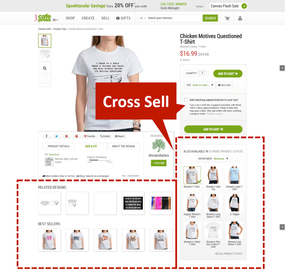
They continue the cross-sell, up-sell process on nearly one-third of the product page, without ever seeming too pushy or over the top.
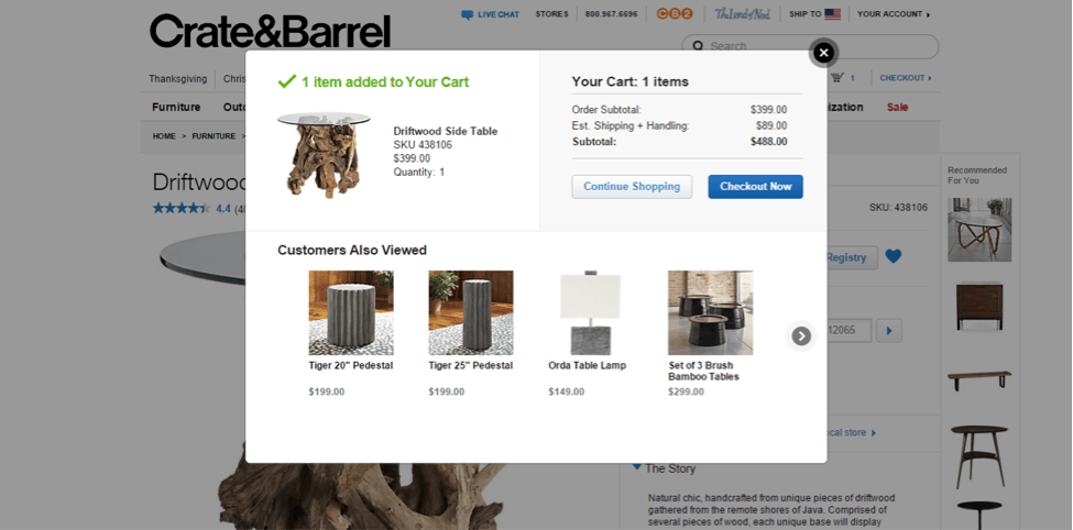
Another interesting cross sell attempt is what Crate & Barrel does with its checkout process. Instead of putting the cross-sell items on the product page, they actually include it inside the cart itself, thus making the cross-sell unmissable by the user.
5. No Surprise Charges, Multiple Payment Options
Another key reason for users to drop out of a purchase process is when they are faced with an unexpected charge or fee that increases the cost of the item significantly. Avoid springing a surprise on your users by disclosing the exact overhead costs that they would be bearing to complete the transaction. It could range from shipping costs to sales tax to convenience fees to gift wrapping charges – whatever be the extras, declare them upfront the way Disney does in its clean checkout process.
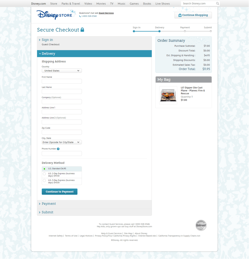
Disney clarifies the various ship times and associated costs, allowing users to pick their own shipping time and adjusting the total price of the purchase on a real time basis.
Total transparency = higher customer trust.
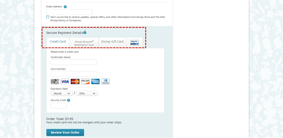
Another big plus in favor of Disney’s checkout page is the variety of payment options that t offers. By allowing payments via regular debit and credit cards to Disney Rewards Cards, Disney Gift Cards and of course PayPal, Disney ensures that no customer goes back empty handed from its site.
Parting Thoughts
The key thing to remember is, no aspect of your ecommerce site will remain ‘ideal’ forever. As customers keep evolving in their online behavior, ecommerce companies will be forced to follow suit. As long as you are open to adaptation, you are open for business.
Author Bio:
Pratik Dholakiya is the co-Founder and VP of Marketing of E2M, a digital marketing agency and MoveoApps, a mobile apps development company. Pratik has contributed on sites like Moz, SEW, SEJ, KISSmetrics, and Content Marketing Institute, to name a few. He’s a “must follow” SEO expert according to Search Engine Watch and has been named one of the top content marketing influencers by Onalytica. He’s passionate about fitness, entrepreneurship, startups, and all things digital marketing.


